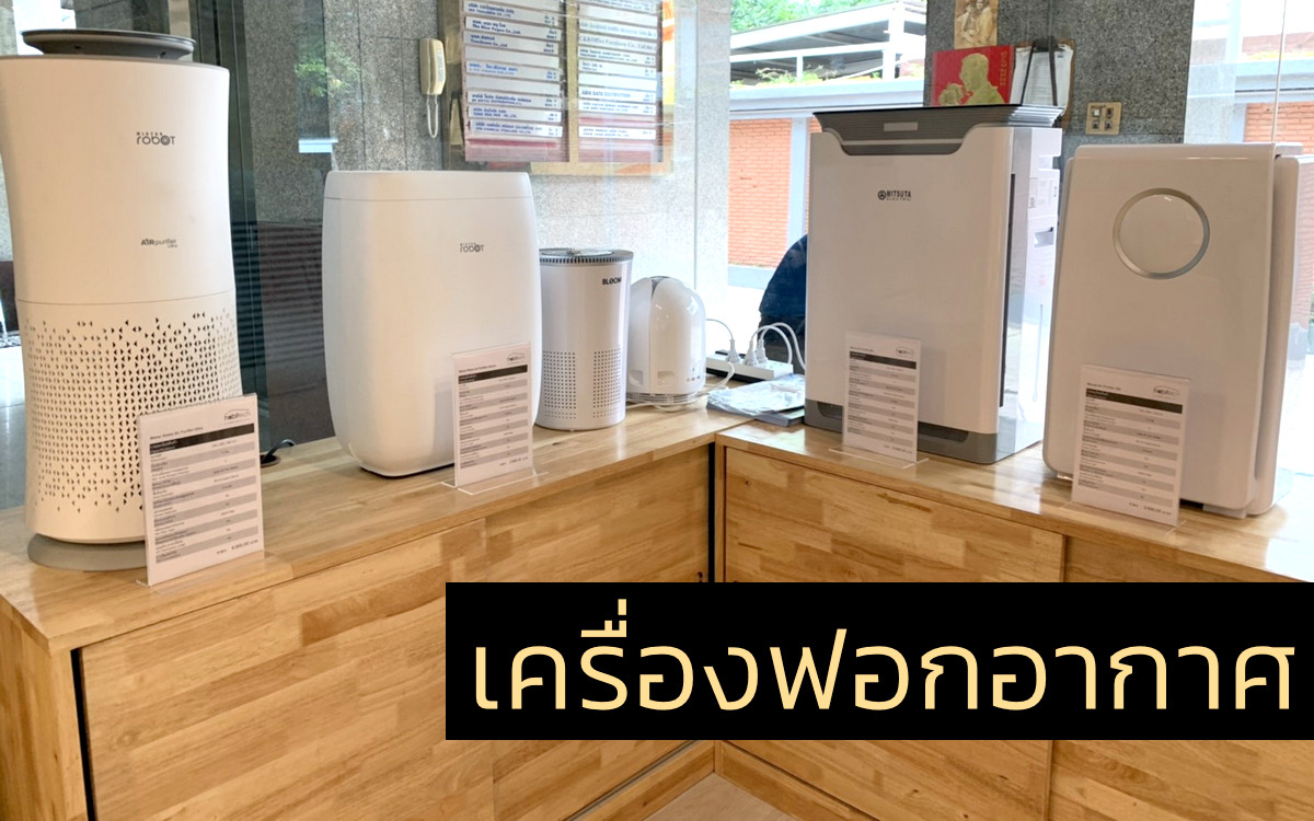
Deprecated: Assigning the return value of new by reference is deprecated in /home/texturl/www/www/wp-settings.php on line 512

Deprecated: Assigning the return value of new by reference is deprecated in /home/texturl/www/www/wp-settings.php on line 527

Deprecated: Assigning the return value of new by reference is deprecated in /home/texturl/www/www/wp-settings.php on line 534

Deprecated: Assigning the return value of new by reference is deprecated in /home/texturl/www/www/wp-settings.php on line 570

Deprecated: Assigning the return value of new by reference is deprecated in /home/texturl/www/www/wp-includes/cache.php on line 103

Deprecated: Assigning the return value of new by reference is deprecated in /home/texturl/www/www/wp-includes/query.php on line 61

Deprecated: Assigning the return value of new by reference is deprecated in /home/texturl/www/www/wp-includes/theme.php on line 1109
*visual sameness, or the difference of words* | texturl

*visual sameness, or the difference of words*

When I was doing regional job searches, I surfed a lot of agency websites. And I saw a lot of similarities. A lot of “we are not an ad agency.” A lot of case studies showing “measurable results.” And a lot of “people”–because ad agencies never call their employees “employees.”

I expected all that. I didn’t expect to find similar work. At least, not exactly similar.

Buried in the portfolio of two different large regional agencies–Archer Malmo in Memphis and DDB Dallas–were two eerily similar executions of a visual concept.

First, Archer’s ad for Turner Dairy:

Archer\'s udder

Next, DDB’s ad for Borden:

DDB\'s udder

Each with a bucket silhouetted against a light background. And each with an udder made of the advertised dairy product.

Now, I’m not really worried about which came first. I’m sure it’s just a brain sync–or at least a brief-sync. After all, the solution is a fairly elegant way to visually demonstrate the key promise of “fresh dairy products.” Kudos to both creative teams for finding a simple solution that distills the promise down to its essence.

The problem I have is larger than two similar looking ads. It’s the hundreds of visually similar ads I see when I review awards shows, design journals, and ad-blogs.

See, there are only so many visual idea-types. So few, in fact, that one book, Mario Pricken’s Creative Advertising, attempts to list them all in about six pages. (It’s a good read, by the way).

Now, I think it’s important to come up with visual solutions to advertising; in fact, I always start my concepting there. But when you rely entirely on the visual to get your idea across–whether it’s just to simplify the idea or because of other reasons (for example, making an idea universal across languages)–you run the rest of seeing your ad again later, done perfectly well by someone else. Don’t believe me? Flip through the last 3 issues of Archive and see how many examples of “light” equaling “bright white” you find. Or better yet, X-rays. Archive loves X-rays.

My point isn’t that visual creativity is wrong. Visual creativity is essential. It’s just that I feel words are important, too.

Maybe that’s just me being worried about my future employment. After all, I got bills to pay, and if people don’t read copy I’m toast. But it’s something I can’t help thinking when I think about ads:

Visuals make ideas simple. Words make them ownable.


No Responses to “*visual sameness, or the difference of words*”